Designing Beyond: Part 1
When we sat down to design Beyond, there were five developers on our team. One had studied computer science, one digital art and technology, one history of art and two biological sciences. Like most web developers, their paths to development had wound up and down and around each other, spurred on by a lot of self-learning and support from other developers.
With Beyond we hoped to help junior developers find their own paths a little easier. It’d provide a fast track to creating the support structure needed to carve their own place confidently in the development world.
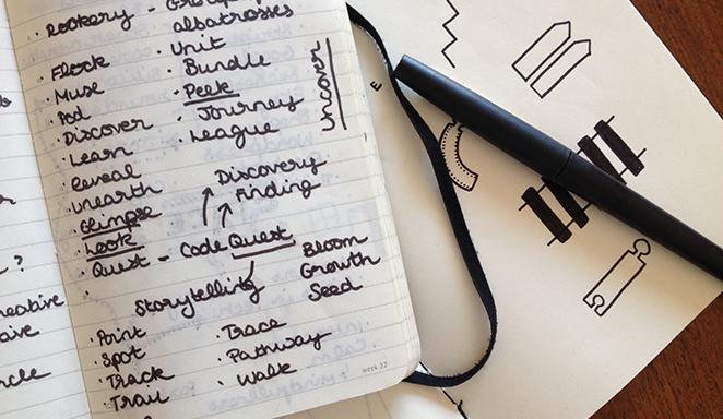
Big goals and visions in mind, we set out to find a fitting name for the event. Brain storming began with words describing collectives - unit, flock, muse. We moved on to words around the idea of storytelling and discovery. Then tracks, trails and traces. As a tribute to our adventure-loving 12-year-old selves, our conference was, for a day or two, called CodeQuest. Shedding this misplaced nostalgia, we went back to the drawing board. Our collection of words was anchored in the right ideas, but lacked aspiration. The event wasn’t just about paths and stories, it was about pushing people to go further with them, and find their way beyond them.
Beyond, then, seemed the perfect name.
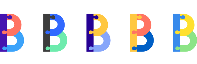
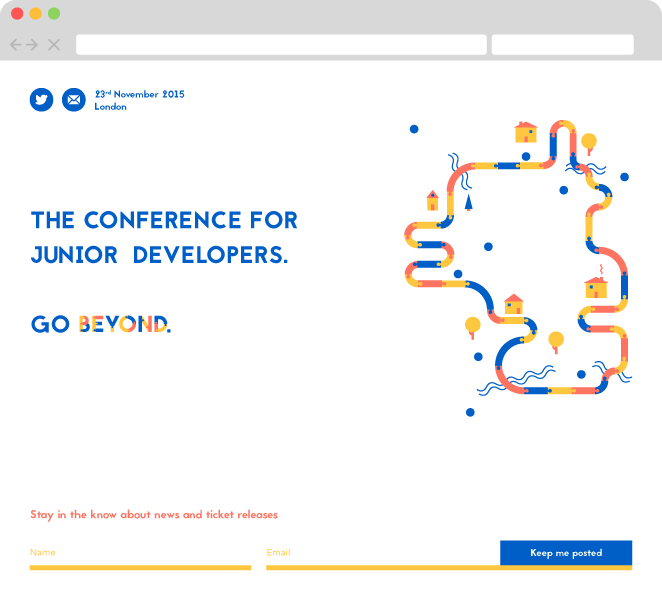
Name down, what about the visuals? Sketching out an assortment of journey related symbols, paths and railway tracks, I thought of those wooden track toys. As most early learning toys do, they provide a blue print for creativity. A child can be as conforming or eccentric as they want with their tracks, but provided they lock the pieces together, they can still push the train from one end to the other. As a visual cue, these puzzle tracks were just what we needed - an emblem of a guiding path which offers you the freedom of choosing your own direction.
The colours, just like the track pieces, would be clear cut but interchangeable. Bold, bright and adaptable to anyone - again, reminders of the childhood joy of learning and play. A couple of days of rejected colour choices later, a subtle take on the primary colours was the clear winner. After all, it made sense that an identity which pivoted on the idea of adaptable building blocks would make use of the three prime colours.
With only one confirmed speaker and workshop, the website design began with little content to play with. The first iteration of the home page looked like this:
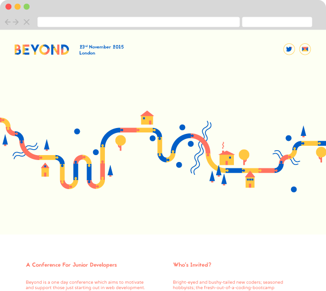
Minimal and bright, but not particularly informative. Feedback from users was a mixture of curiosity and slight confusion - who, exactly, was this event for? And, as the lead developer on the project was quick to point out, the pale background colour was, at best, a tea-stained colour for anyone with a fancy Mac screen, and at worst, imperceptible to the naked eye. When designing for the web, accessibility needs to be considered at every stage of the design process. Yet just as I had done, it’s too often forgotten about, or even willingly overlooked in favour of the aesthetics.
A couple of iterations later, no more tea-stain. Still, we were holding back on essential information. The code of conduct was hidden in a link in the footer; there was no mention of the extra workshops that were to be announced; and the homepage provided little detail on what the speakers would be talking about. We'd assumed that users would somehow unearth this information themselves. Feedback told us otherwise, and proved that the information needed to be far easier to consume.
More and more iterations came and went, and the original layout began to fade. The strength of the design though, lay in the core branding. The modular shapes and colours could be moulded to fit each new iteration without losing their original impact.
What you’re looking at now, like most websites, is still considered a work in progress. As I sit here and type this, notifications from GitHub are pinging at the top of my screen telling me about such and such improvement that’s happening on the development side. Knowing that your product is sitting out there unfinished in the big wide world for all to see is daunting. The temptation to tell people not to look at it yet because “tomorrow it’ll be even better when we’ve added that other bit” is hard to fight. But user-driven design is an exciting process. It pushes you to be continuously creative, finding solutions for problems you didn’t know you had. It reminds you that unless you’re creating for you and you only, design can’t happen in a vacuum.
In Part 2 of this blog post, we’ll take a deeper look into the usability challenges we faced along the way and how we got around them.